The following is a revision of something I wrote for fun in 2020. I’d like to revisit this later to incorporate the new clubs which have been added to the league, but it’s notable that the worst four brands on this list no longer exist. (The featured image is of a draft fan logo I mocked up for San Diego Legion. I was proud of it at the time, but in hind sight it leaves me wanting more.)
Major League Rugby offers a unique glimpse into the intersection of ambition and artistry, where bold design choices aim to capture the spirit of the sport but can also highlight the challenges of creating a cohesive and memorable identity. Some teams succeed in crafting brands that feel authentic and enduring, while others reveal what logos and names look like when treated more like afterthoughts than icons.
I – Seattle Seawolves
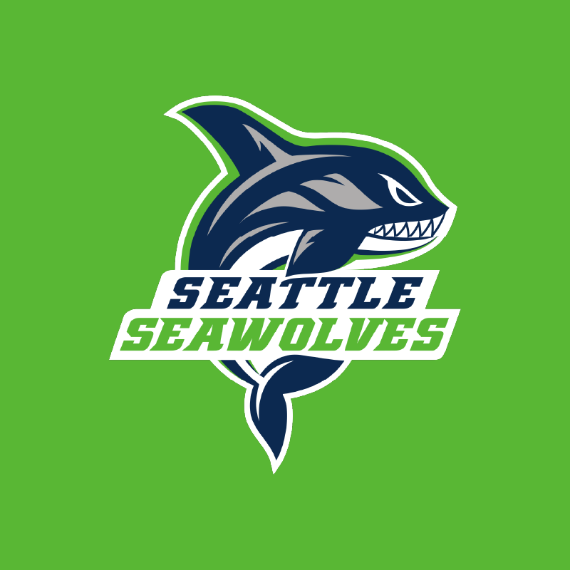
In the world of sports branding, few teams have managed to capture the essence of their locale as effectively as the Seattle Seawolves. Their logo isn’t just a mark—it’s a calculated symphony of regional identity and visual storytelling.
The name itself is a brilliant strategic choice, seamlessly blending geographic specificity with a powerful mascot. By echoing the conventions of successful local sports franchises like the Seattle Seahawks and Vancouver Canucks, the Seawolves tap into an existing emotional reservoir of fan loyalty. This isn’t mere imitation; it’s sophisticated brand architecture.
Visually, the logo is a triumph of simplicity and versatility. Its sharp, distinct lines and clean design ensure it translates beautifully across multiple mediums—from massive stadium displays to the smallest favicon. The color palette is equally considered, creating instant recognizability.
But what truly elevates the Seawolves beyond mere graphic design is their holistic brand experience. Their passionate fan base, combined with unprecedented success—including two inaugural titles—transforms the logo from a static image into a living symbol of athletic excellence.
II – Utah Warriors
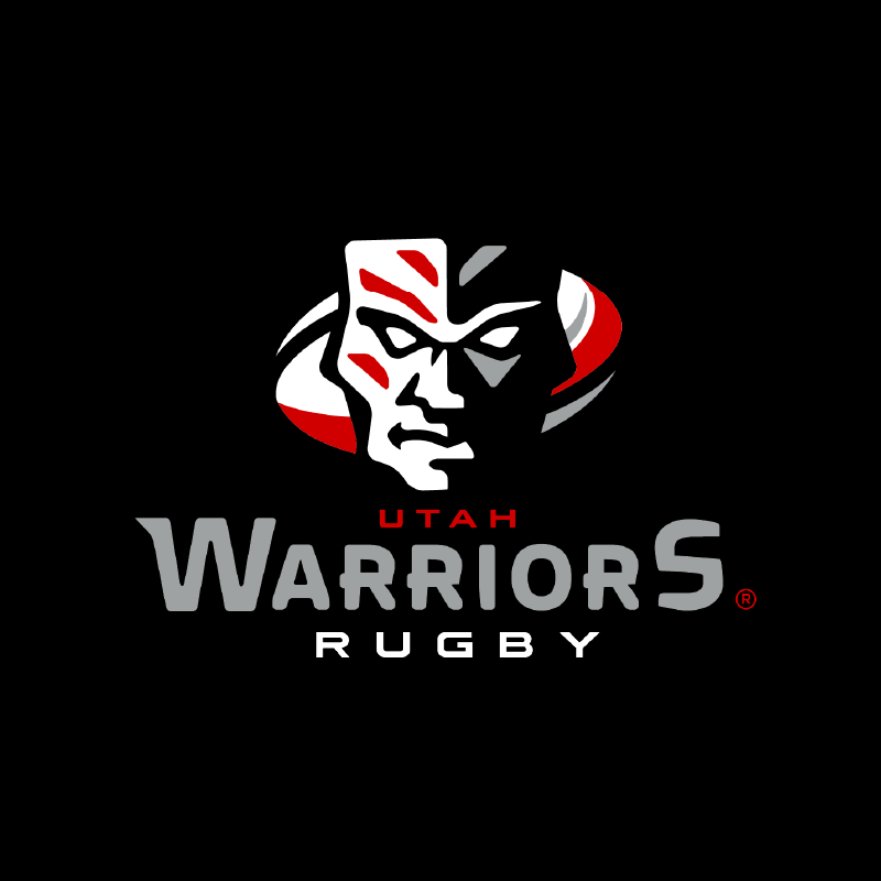
In the pantheon of America’s place+mascot naming convention, the Utah Warriors stand as a paragon of strategic branding. Their logo transcends mere visual representation, instead crafting a narrative of athletic prowess that resonates deeply with rugby’s warrior-like ethos. It is second only to the Seawolves, largely due to the fact that their success in style hasn’t translated into success on the field.
The stylized warrior face walks a nuanced line between cultural homage and modern design, nodding subtly to the Pacific Island rugby traditions while remaining distinctly contemporary and culturally ambiguous. Its painted visage—at once a mask and a statement—captures the cultural complexity of rugby’s global heritage.
Technically, the logo is a masterpiece of graphic economy. Its bold lines and simplified styling ensure legibility at any scale, from the most expansive stadium signage to the most diminutive favicon or lapel pin. The color scheme strikes with the same precision as a well-executed rugby play—bold, uncompromising, memorable. While not No. 1, it is my favorite.
III – Toronto Arrows
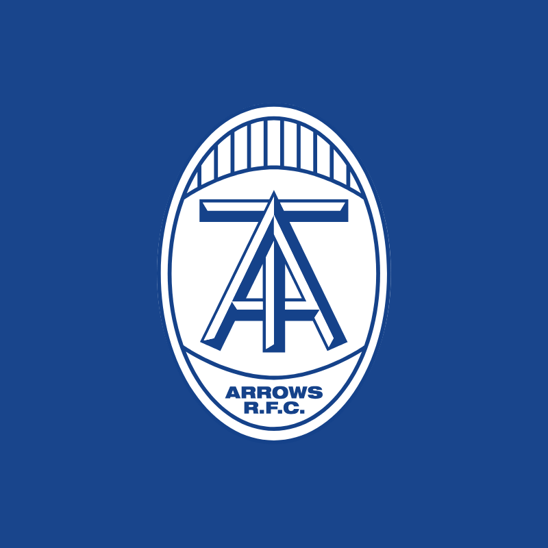
For devotees of graphic design, particularly those who appreciate the nuanced art of word marks and monograms, the Toronto Arrows represent a sophisticated approach to team branding that goes far beyond mere visual decoration.
The place+mascot naming convention finds its most elegant expression here. “Arrows” is not just a mascot, but a metaphorical weapon—sharp, directional, purposeful. The “TA” monogram embedded in the logo becomes more than a mere identifier; it’s a typographic event that demonstrates remarkable design intelligence. On fixture tables, scoreboards, and digital platforms, the monogram remains crisp and legible—a critical consideration often overlooked in sports branding. The “#ArrowsUp” tagline elevates the brand further, transforming a visual mark into a rallying cry with just the right balance of machismo and wit.
IV – Houston Sabercats
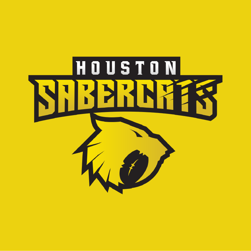
In the grand tradition of American sports marketing, the Houston Sabercats embody a particular strain of regional branding that is equal parts audacious and endearing. The place+mascot formula finds near-perfect expression in this Texas-based franchise.
The logo is a complex narrative of design choices. The wordmark is especially excellent. Those subtle “kitty scratches” aren’t mere decorative elements, but a narrative device suggesting ferocity and movement. Unfortunately, all the budget must have been spent on the lettering, because the sabercat mascot feels unfinished and treads a curious line between fierce and faintly comedic. Using the empty space in the mascot’s mouth to form a rugby ball seems forced and gives the vague impression the poor gato has bitten more than it can chew and is perpetually gagging helplessly. I can’t help but see Dennis Quaid’s memorable moment in “Dragonheart”— but maybe that reference speaks more to this author’s cinematic sensibilities than pure athletic iconography.
V – NOLA Gold
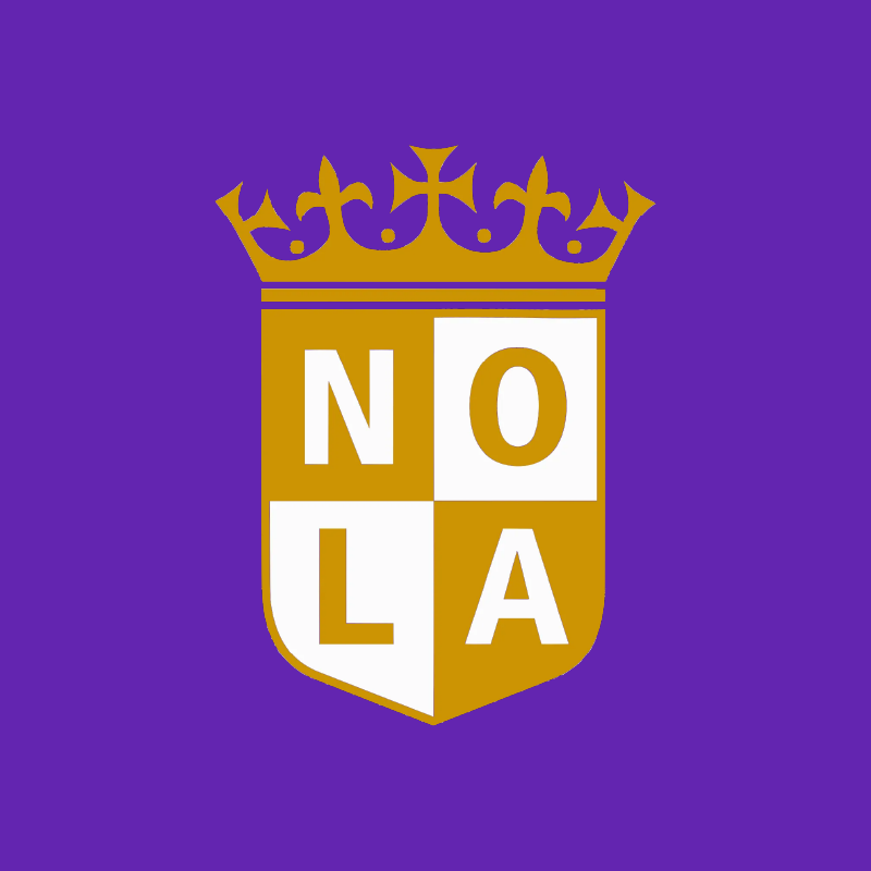
In the realm of sports heraldry, few brands capture local identity with such unapologetic panache as NOLA Gold. This is heraldic design as a form of cultural performance—a logo that doesn’t merely represent a rugby team, but embodies the theatrical spirit of New Orleans itself.
The shield becomes more than a mere graphic element; it’s a canvas of deliberate ostentatious excess. That gold and crown aren’t just design choices—they’re a declarative statement about the city’s baroque sensibilities. By incorporating subtle Mardi Gras color influences—those hints of green and purple—the brand transcends typical sports marketing, instead becoming a nuanced cultural artifact.
For the heraldry enthusiast, NOLA Gold presents a fascinating case study. The truncated city name “NOLA” operates with a linguistic efficiency that eludes other geographic abbreviations. Where “ATL” feels sterile and perfunctory, “NOLA” vibrates with cultural specificity—a linguistic shorthand that carries more narrative weight than entire marketing departments could hope to achieve.
VI – Old Glory DC
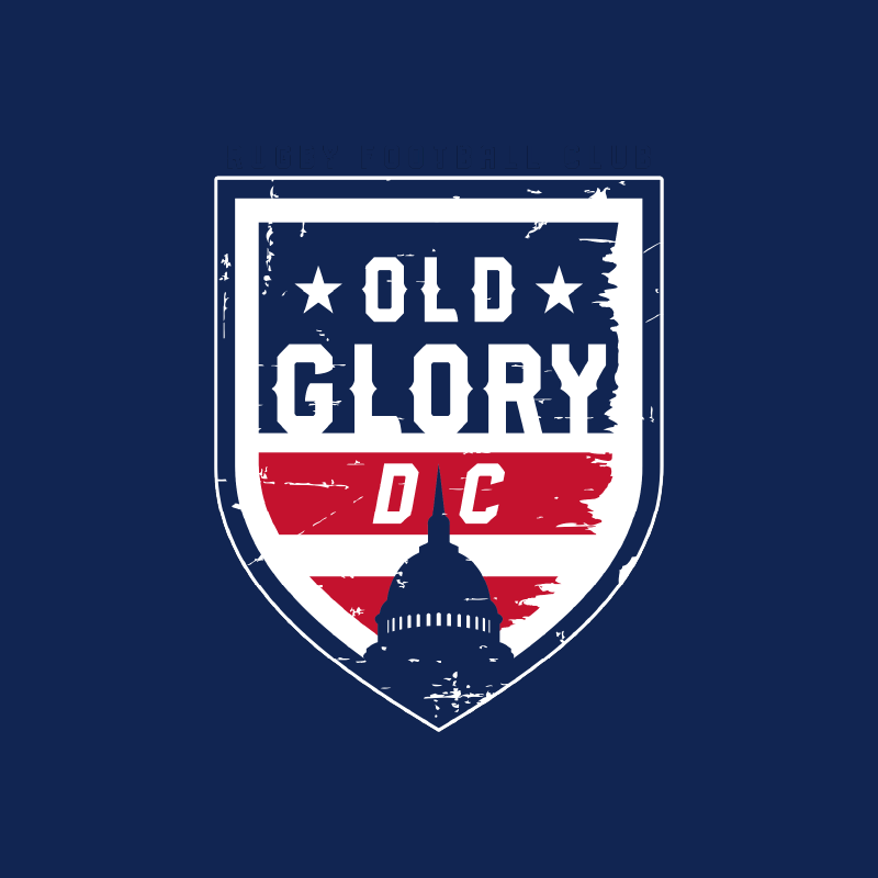
Emblematic of Washington D.C.’s complicated relationship with symbolism, Old Glory DC represents a branding exercise that feels simultaneously overwrought and underwhelming—a visual compromise that could only emerge from a city built on committee decisions.
The curious syntax of placing “DC” after the mascot name speaks to a design-by-consensus approach that defies conventional sports naming. One imagines lengthy meetings where graphic designers and marketing executives debate the placement of each typographic element with the gravity of a constitutional convention.
The partial incorporation of the American flag feels like an apologetic nod to patriotic sentiment, while the inexplicable inclusion of the U.S. Capitol building suggests a branding strategy caught between civic pride and institutional self-importance. It’s a logo that doesn’t so much represent athletic ambition as it does a government procurement process.
VII – New England Free Jacks
The Free Jacks present a compelling case study in sports branding, combining regional mythmaking with the challenge of constructing an athletic identity from scratch. Their patriotic theme resonates deeply with New England’s cultural roots, aligning cleverly with the branding traditions of other local teams like the Patriots and Revolution — no doubt a deliberate effort to forge regional loyalty and anchor a new team within a well-established sports ecosystem.
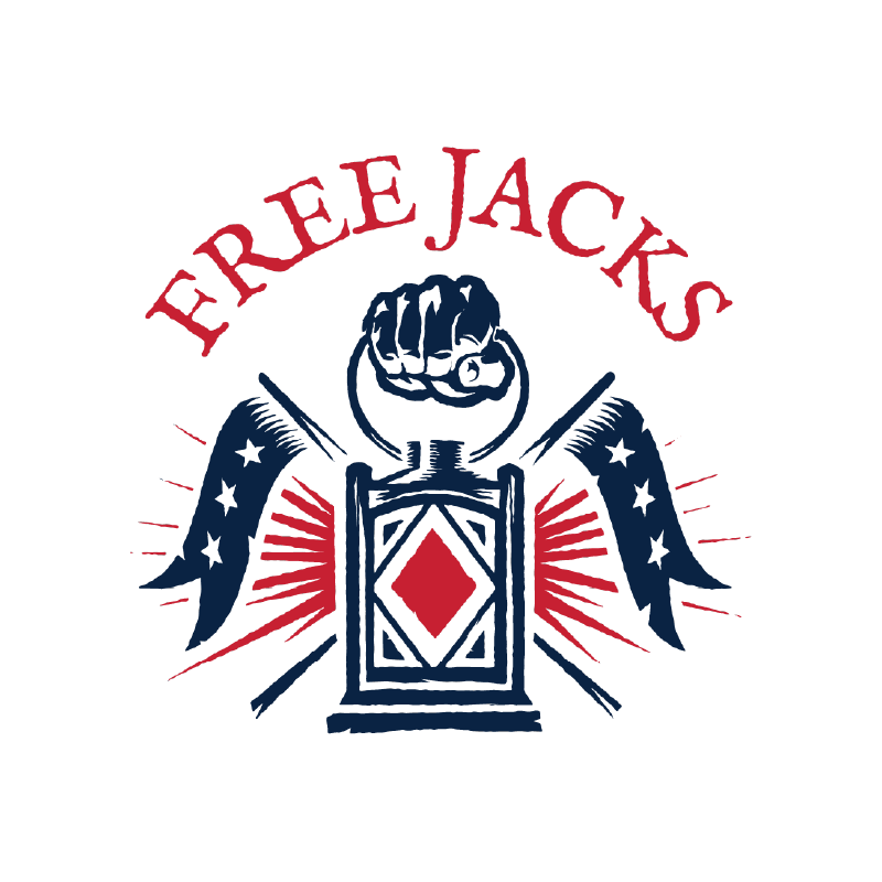
The theme is more than surface-level marketing. It’s an narrative framework that links athletic performance with New England’s storied past. Yet, the visual representation of this vision is where the Free Jacks stumble. Their two logos—one featuring a stylized lantern and another depicting Paul Revere on horseback—are striking in their detail but falter in utility. While they shine on screen-printed merchandise, their complexity diminishes clarity at smaller scales, a crucial test for effective sports branding.
The name “Free Jacks” aspires to conjure historical gravitas but, by the team’s own admission, it is a fabrication—a linguistic invention meant to evoke the revolutionary ethos. For New Englanders steeped in the region’s rich history, this manufactured nature feels slightly dissonant, even if the spirit behind it is admirable.
As a New England native, I find myself torn. I appreciate the nod to classical styles, including their rugby jerseys with traditional collars—a rare and nostalgic touch in modern sportswear. The revolutionary imagery and rough-hewn aesthetic strike a chord, tapping into the area’s love for both history and sport. Yet, the branding falters where it matters most: clarity. What could have been an iconic emblem of New England rugby instead feels overburdened by its own ambition, its message blurred by competing elements.
Ultimately, the Free Jacks succeed in fostering excitement and breaking into a competitive market, but their brand remains a work in progress. The question, “What is a Free Jack?” lingers—not as a clever marketing mystery, but as an emblem of the uncertainties inherent in building a team’s identity from scratch. For now, they remain a fascinating experiment in how far a team can go by borrowing heavily from history while striving to make their own.

VIII – San Diego Legion
With the entire visual history of Rome offering a veritable buffet of potential iconographic elements—heroic warriors, mythical creatures, imperial standards— it’s a shock to me more teams around the world haven’t leveraged Greco-Roman themes for mascots. An even greater surprise is that San Diego Legion somehow managed to produce a logo that utterly squanders this conceptual potential. Instead, we’re presented with an anachronistic medieval shield hosting two modern sans-serif letters that look more like a placeholder than a considered design.
There’s a design concept in heraldry and vexillology, only metals on colours and colours on metals. Without getting into the details, it’s a rule to ensure enough contrast exists between elements so they remain legible. Both black and red are defined as colours in heraldry, and placing one onto another is a cardinal sin. The San Diego Legion logo color scheme of black on red promises visual drama but delivers ocular assault. It’s a palette that doesn’t so much complement as it does violently collide, creating a logo that seems more likely to induce migraines than athletic excitement. Thankfully, there are versions of their logo out there which incorporate white (another heraldic metal) but this does not make up for the drought of classical style and iconography.
IX – Rugby ATL
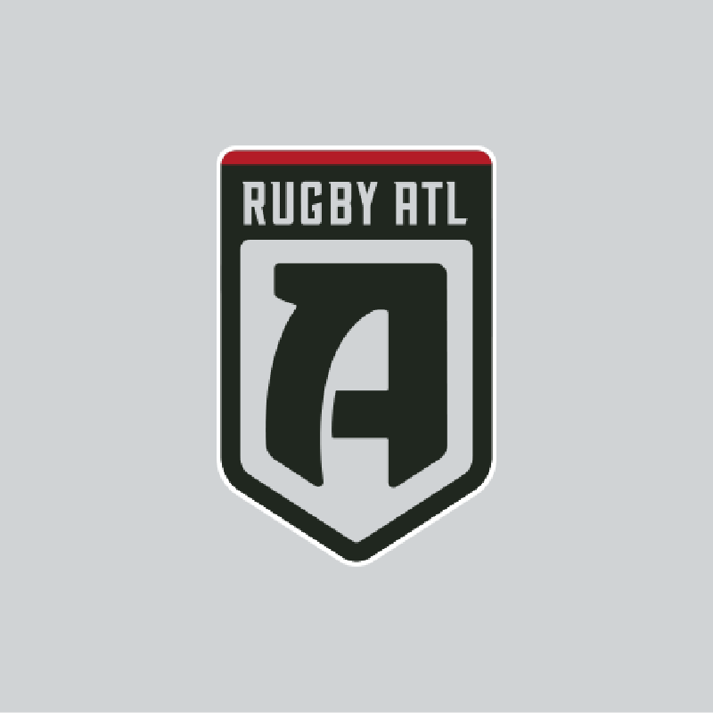
Rugby ATL is a name that sounds less like a sports team and more like some sterile alphanumeric code in monospaced font at the top right hand corner of your boarding pass.
The decision to use the airport code “ATL” reveals a fundamental misunderstanding of sports team nomenclature. Where other franchises have crafted names that speak to local identity, Rugby ATL has instead opted for bureaucratic shorthand. Maybe Atlantians are particularly proud of their massive hub. To be honest, I boast about the superiority of my own local PWM, but it would never cross my mind to use this as a motif for anything other than a travel blog.
As for the logo, the stylized “A” suggests glimpses of design potential—a typographic flourish that hints at what might have been had more creative energy been invested. But it remains just that: a hint, a tantalizing suggestion of brand identity abandoned in favor of expedience.
X – Rugby United New York
New York City—global capital of design, marketing, and visual storytelling—has somehow produced a brand that looks like it was conceived during a quick stop for bagels in Brooklyn and which should have been quickly abandoned on a crumpled napkin.
The tortured word order of “Rugby United New York” betrays an almost pathological desire to create the acronym RUNY, sacrificing linguistic clarity on the altar of typographic cleverness. It’s a naming strategy that would make even the most forgiving linguist wince.
Visually, the logo defies basic principles of graphic design. Its vertical orientation suggests a fundamental misunderstanding of how logos function across various media. The only place it might not looked cramped would be a pencil. That being said, they’ve followed Seattle and Boston in their tactical choice to piggy back on the success of other local sports brands by incorporating a color scheme from the Mets, Knicks, and Islanders and also some fancy pin stripes for their uniforms a la the Yankees.
XI – L4 (or LA?) Giltinis
Buckle up buttercup — the next two really grind my gears.
The Los Angeles Giltinis stand as a monument to narcissism—a logo that appears to have been conceived by an embarrassingly drunk colleague during an awkward happy hour. The team’s visual identity seems less an homage to rugby or LA and more a desperate cry for attention from an aspiring Australian mixologist with too much money to spend.
The logo’s most notable feature is its inexplicable pink hue, which radiates all the subtlety of a flamingo at a black-tie event. That olive perched awkwardly in the design looks less like a rugby ball as intended and more like a garnish that wandered away from its cocktail, confused and slightly embarrassed.
One can almost hear the marketing meeting: “What says ‘fierce rugby competition’ better than team named after a made-up cocktail previously named after the owner?” Sincerely, literally anything else. The Giltinis brand doesn’t so much represent a rugby team as it does a midlife crisis expressed through graphic design and liquor nomenclature.
It’s unclear if the ‘A’ mysteriously transforming into a ‘4’ was an intentional avant-garde statement or obscure reference that I don’t get or a design process that involved more cocktails than creativity. It’s a logo that doesn’t so much break design rules as it does stumble past them, drink in hand, hoping no one will notice.
XII – Austin Gilgronis
The Austin Gilgronis represent a cautionary tale of sports branding—a corporate vanity project so spectacularly misguided it threatens to redefine the very boundaries of marketing incompetence. This is less a rugby team and more a case study in how not to construct a sporting identity.
The team’s visual evolution reads like a tragic descent into corporate madness. What began as Austin Elite Rugby—with a shield logo that captured the quintessential Texas spirit—devolved into a bewildering freak of nature over several iterations. The ‘Austin Herd’ stopover was a brief moment of redemption, a name that managed to be both logical and distinctive. But the intervention of an insecure oligarch would not be denied.
The arrival of one Australian investor introduced the Gilgronis brand, and with it, the Giltinis as well—of course, because (surprise!) the owner’s name begins with “Gil.” But “Gilgronis” sounds less like a sports team and more like a linguistic mishap, the kind that might occur after accidentally inhaling a Negroni down the wrong pipe. As your date, oblivious to your struggle for air but horrified by your gagging, pleads to know what’s wrong, you manage to squeak out the garbled word: “Gilgroni.”
The logo itself feels like the unintended result of a graphic design mishap. Those wayward vector points convey a level of technical carelessness that’s as baffling as it is excruciating to behold. The typography contorts and bends in a way that lacks any sense of deliberate design, evoking a reaction that would bring even the kindest design instructor to tears. As for the mapping of Texas—if it can even be called that—it appears more like the hallucinatory output of a cartographer working under dubious conditions than any legitimate stylized geographical depiction.
What truly elevates this branding disaster to legendary status is its complete disconnection from the fundamental purpose of a sports team identity. This isn’t just bad design; it’s a wholesale abdication of the basic principle that a team’s brand should inspire, unite, and represent its community. Instead, the Gilgronis (and Giltinis) exist only for one man who seems more interested in stroking his own ego than connecting with fans.
Epilogue
Since this was originally written in 2020, much has changed in MLR, including many of the brands. I will issue a new ranking in the future including the new teams, which again run the gamut in terms of brand quality: Anthem RC, Chicago Hounds, Miami Sharks, and Rugby FC Los Angeles. In the meantime, I wanted to update on some of the brands featured in this 2020 ranking.
Toronto Arrows
While many of these teams no longer exist, some made last ditch branding changes while trying to stay afloat. That includes No. 3, Toronto Arrows. They abandoned their monogram for an icon I think was equally impressive. It was more modernist featuring a bold letter A with some red, white, and blue feathering. When it was announced, I only saw this icon. Apparently, they had another supporting logo shield featuring a piece of Canadian military hardware. I’m less enthusiastic about it, but still a solid choice. What baffles me, though, is why they didn’t lean into the Canadian motif and stick with just Red and White. Unfortunately, as good as it was, the A icon in particular really invokes G.I. Joe, a distinctively American, patriotic motif.
New York
After my review and criticism of their name and the odd aspect ratio of their logo, New York made a wonderful brand refresh. They adopted a mascot and new name: the New York Ironworkers. Frankly, I feel it’s brilliant. It invokes the grittiness of the Big Apple with a great sense of pride, which is just so like every New Yorker I’ve ever met – no where in the world do people brag more about how grimy and rough their home is. Simultaneously it expresses a great deal of strength and determination. They adopted a round seal-like logo, which was not incredibly impressive, but was nonetheless a substantive improvement. More impressive was their use of a secondary wordmark, “Ironworkers,” in a bold impact style font. It could have been mistaken for a trendy fashion brand, but unfortunately it wasn’t enough to keep the team afloat. The Ironworkers have folded, in part due to an obstacle that impacted their brand: location. A stadium or pitch is a critical component of a team’s identity, and unfortunately RUNY/Ironworkers were not able to find a reliable and adequate home. Being from the Boston market, one might think I’d be celebrating, but honestly NYC represented the best opportunity for a fun and meaningful rivalry for the New England Free Jacks. We love to hate each other. I hope they are resurrected in the future and bring back the Ironworkers name with them.
Atlanta > LA
Rugby ATL has moved to LA. They’re still struggling with practical naming, having landed on RFCLA… or LA Rugby … or Rugby Football Club Los Angeles. Actually the worst version I’ve seen so far is the version I’ve seen the most – Rugby FC LA – which isolates the “FC”, causing confusion about what sport they even play. The logo is unremarkable as well, a neon monogram of “LA” where the “L” is complete lost and reminds me more of a whacky inflatable tube man.
The Gils
Last but not least, both teams owned by Australian entrepreneur Adam Gilchrist were disqualified and shutdown by MLR due to undisclosed violations of league rules. Oddly enough, those violations had nothing to do with their atrocious team names and childish logos. Instead, it seems some shady decisions were made around player salary caps. Perhaps cutting corners on the outside is a clue that corners are being cut inside too? Fortunately for LA, they still have a team, but it’s sad to see the loss of a pro team in Austin. If there’s an angel investor out there who doesn’t feel the need to confuse the team with a fake cocktail, I hope they consider bringing back Austin Herd.
